Graph 201 · Advertising Design · Fall 2026
Typography Layouts
Four layouts with the same text, using the same paragraph and character styles on a 5 × 8 grid.
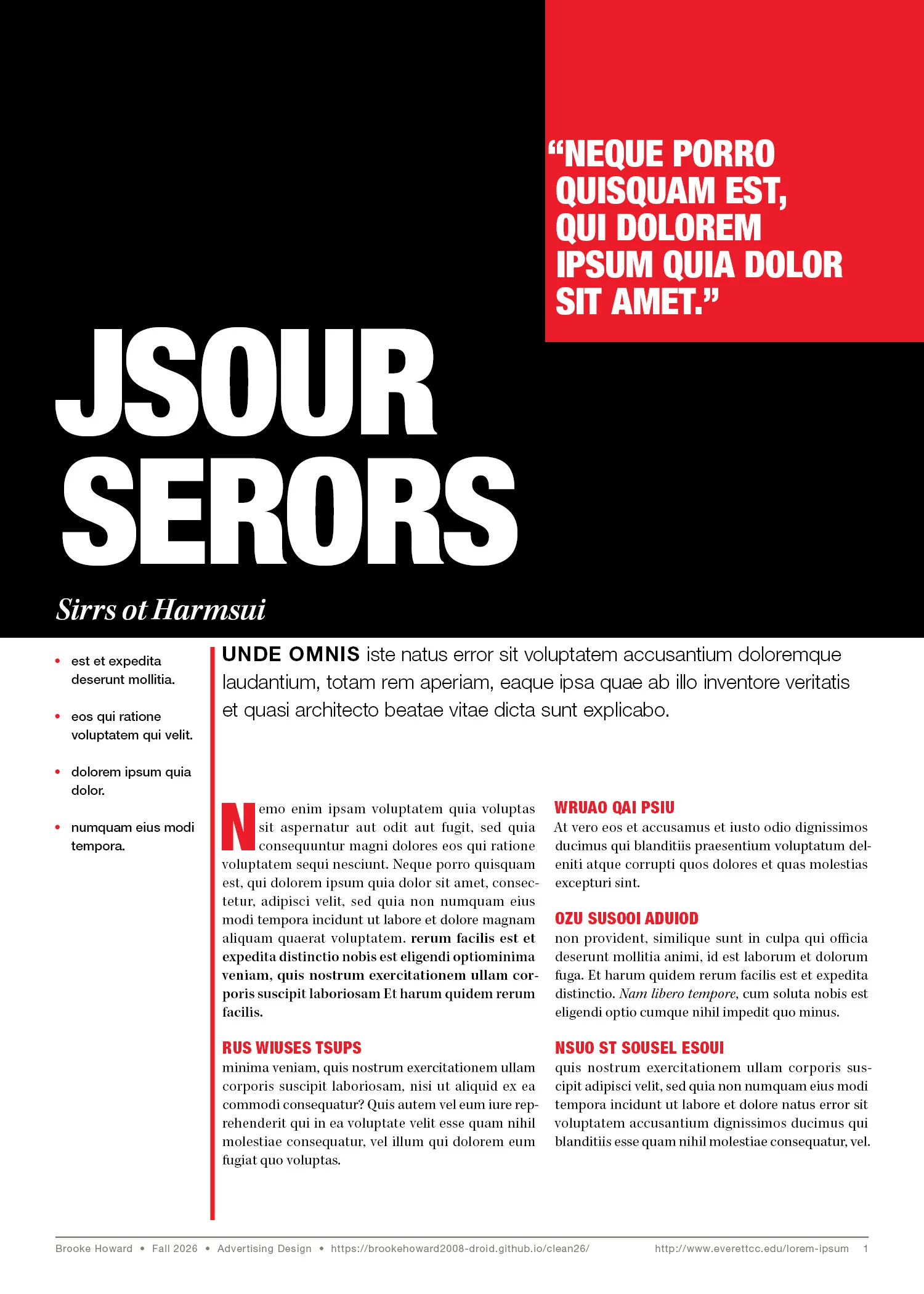
This page uses only type. The title and pull quote are on a black and red block at the top, with two columns of text and the bullet list below.
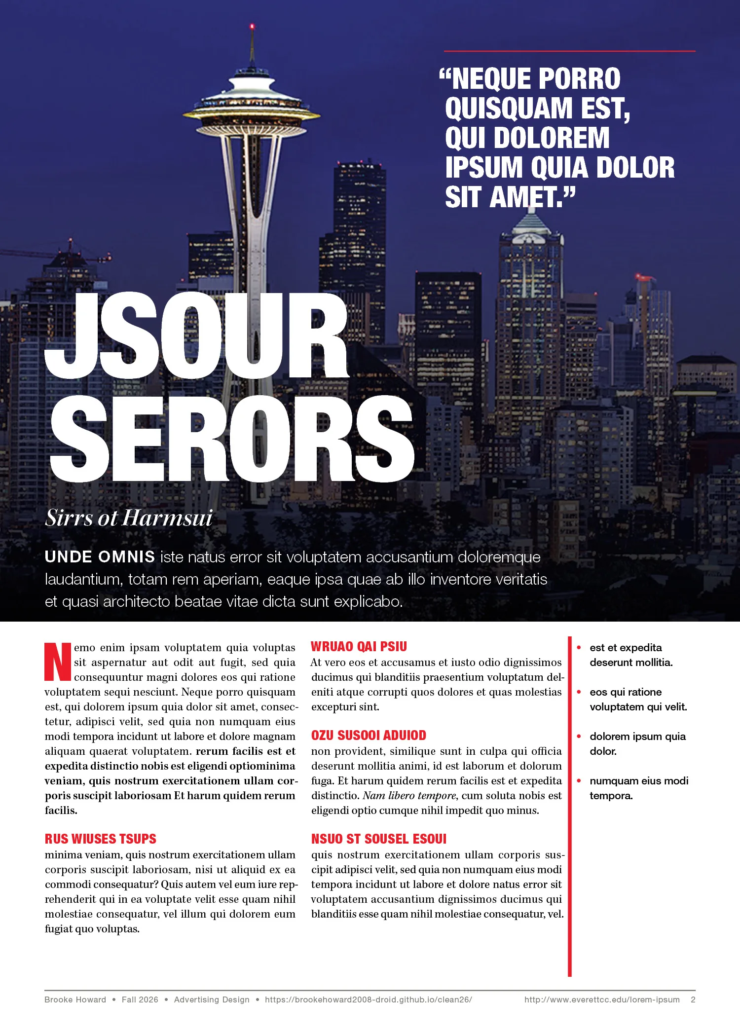
The Seattle photo covers the top of the page. I added a dark gradient so the white title and intro are easy to read over it.
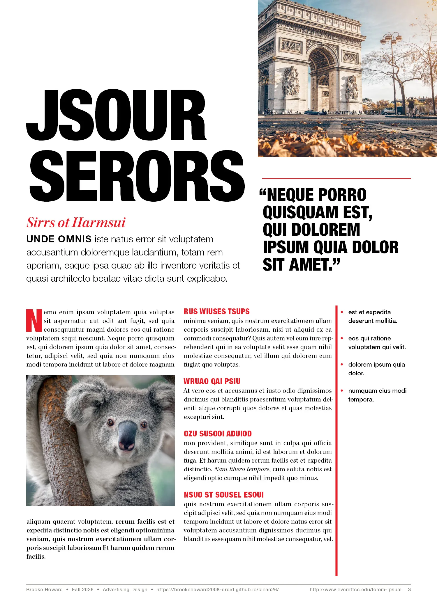
The koala photo has a 6 pt text wrap, so the text goes above and below it.
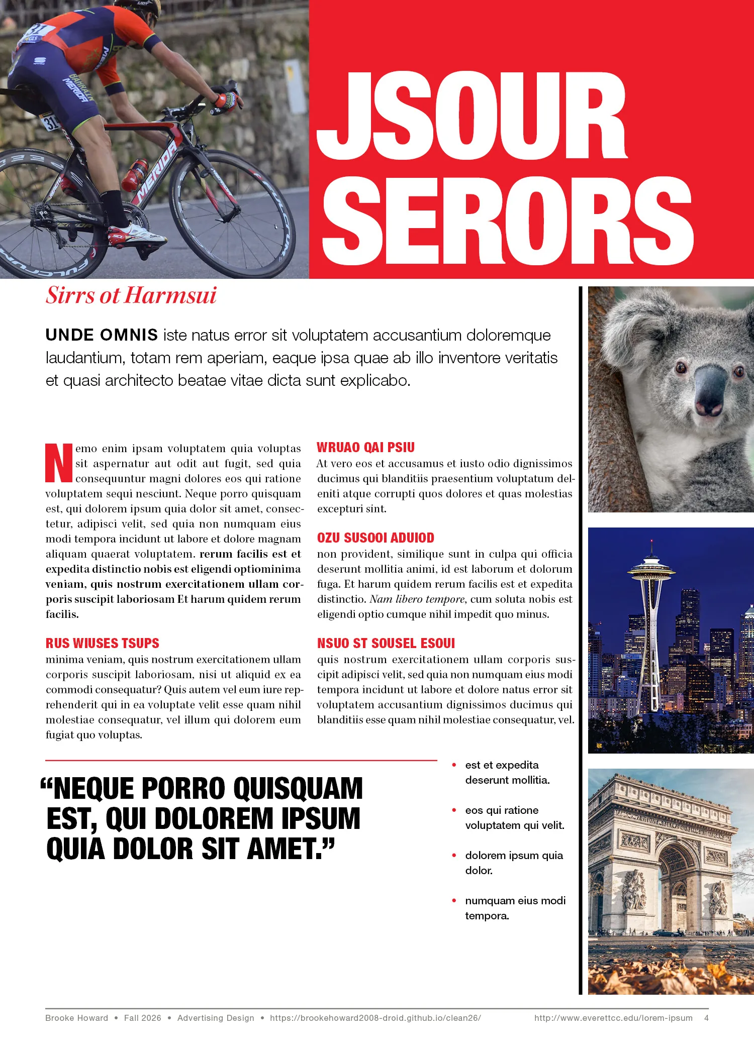
A column of three photos runs down the right side, with a line separating it from the text.
Grid
- Page
- 600 × 840 pt, single pages, 0.125″ bleed
- Margins
- 36 pt top and sides, 48 pt bottom
- Guides
- 5 columns × 8 rows, 12 pt gutters, fit to margins
- Baseline grid
- 12 pt
Type
- Title
- Helvetica Neue LT Pro 97 Black Condensed, 96/84, all caps, tracking −10, optical kerning
- Body text
- Kepler Std Regular, 9.5/12, justified, aligned to the baseline grid
- Subtitle
- Kepler Std Semibold Italic Subhead, 21/24
- Pull quote
- Helvetica Neue Black Condensed, 24/24, with a 5 pt red rule
Styles
- Paragraph styles
- Title, Subtitle, Lead Paragraph, Body Text, Body Text Drop Cap, Section Subtitle, Bullets, Pull Quote, Footnote
- Character styles
- Bold, Italic, Accent, Drop Cap, Knockout, Lead-In, Lead-In Knockout